Chicago’s Major League Soccer team, Chicago Fire, is building on a strong foundation on and off the field—with a new corporate re-branding and a redesigned new logo.
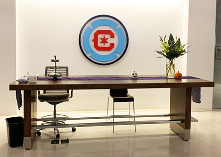
The Fire, which now plays home games at Chicago’s Venerable Soldier Field, tapped Chicago Scenic to fabricate its new logo in two three-dimensional versions for its new office space. One of the new logos now hangs behind the reception desk in the team’s main lobby and the other one is displayed in the team’s event space.
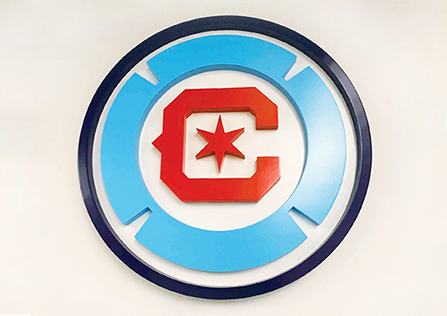
According to Jason Dornbush, the Chicago Scenic project manager on the Fire project, the new logo plays off of the City of Chicago’s flag. Through discussions with the Fire team, Chicago Scenic learned that they wanted the logos to be dimensional, with the white part of the logo recessed from the red and blue colored parts.
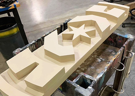
Chicago Scenic’s technical designers created renderings of the logo designs and shop carpenters programmed the CNC machine and router to create the precise cuts for the layered parts. The logos were made out of sign foam, a foam with similar properties to wood and with the same density, but lighter weight, making it a better choice for hanging or cleating pieces on walls.
Since one logo was meant for the Fire’s event space, where alcohol and food are often served, sign foam was also chosen because of its durability. Chicago Scenic’s paints department rendered the colored layers—blue, white, red—with automotive paint which has a high gloss finish and creates a seal around the foam, helping to ensure longevity. Any unexpected spills can be easily wiped off and the logos returned to their original appearance.
The finished logos are large—almost four-feet in diameter—so the shop team created a real-size prototype—nearly 4-inches thick with the various layers compiled—to show the team the overall scale of what the finished logo would look like. Once the team approved the prototype, Chicago Scenic fabricated two permanent logos and installed them at the Team’s headquarters.


